Dashboard widgets
A dashboard widget offers a summary of a platform’s functionality, status, or individual service. Widgets provide actionable information that helps the user quickly accomplish a task or track key metrics.
Status:
Maintainer:

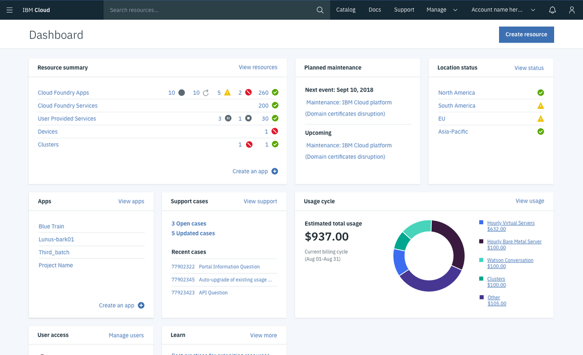
Example of a dashboard using widgets
Anatomy
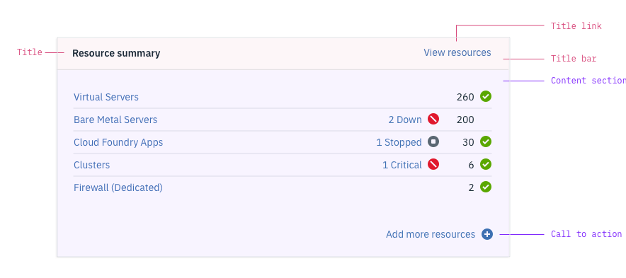
Each widget has a title bar and a content section. The title bar is standard for all widgets, but the content section varies depending on the type of widget.

Title
The tile identifies the widget. Max characters: 23 (including spaces)
Title link
A title link directs users to a more complete view of the information summarized in the widget. The link’s content should be as specific as possible (e.g., “View resources” instead of “View all”). Max characters: 15
Call-to-action
A call-to-action offers the user a quick action in the widget. The call-to action is optional and can incorporate a plus icon if appropriate. Max characters: 23
Variations
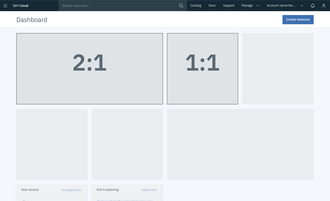
Dashboard widgets have two possible sizes, small and large. The height for both sizes is fixed at 310px. Neither widget is resizable.
| Variation type | Purpose |
|---|---|
| Small widget (1:1) | Standard widget type |
| Large widget (2:1) | Typically used to show data visualization |
| Core widget | Displayed on the dashboard by default and displays platform functionality |
| Service widget | Must be actively added to the dashboard by the user |

Comparison between small and large widgets
Core widget
Core widgets are displayed on the dashboard by default. They typically display platform functionality, such as maintenance events and support cases.
Service widget
Service widgets must be added to the dashboard by a user. Users can add service widgets through a “Customize dashboard” menu.