Chart anatomy
The elements constructing each chart are designed to work in harmony. Each piece plays an important role in data communication.
Note: This guidance is a work in progress. To see our roadmap, make feature requests, or contribute, please go to carbon-charts GitHub repository.
Rectangular charts
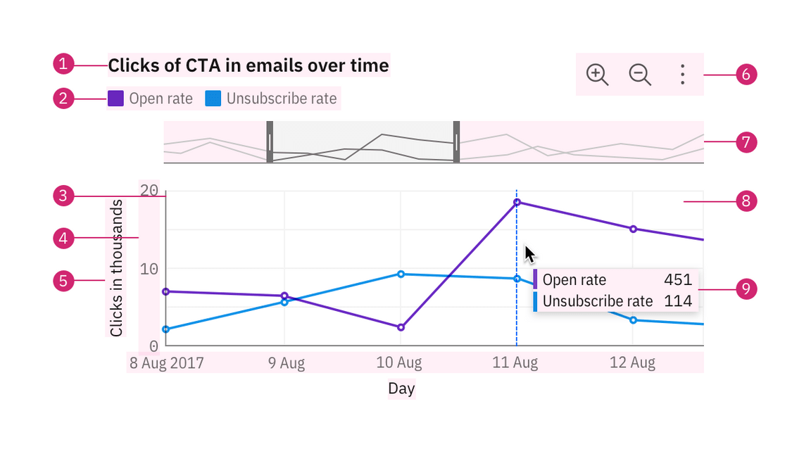
Most data visualizations are rectangular charts, with two dimensions represented on a vertical and a horizontal axis. Rectangular charts are typically constructed with a set of common elements including a legend, axis titles, and navigation tools like a zoom bar and tooltip.

Chart title
The title of a visualization should be concise and descriptive and should reflect the insight the data reveals.
Legend
Many charts will use different visual properties such as colors, textures, and shapes to represent different categories or dimensions of data. A legend tells you what these associations mean and helps you to determine the chart’s meaning. Read more on legend usage.
Axes
The X-axis is horizontal and the Y-axis is vertical. Axes should be accessible against their background with a 3:1 contrast ratio. Read more on axes usage.
Tooltip
A tooltip is a message that appears when a cursor is positioned over an element, such as a data point, icon button, or truncated text. By default, tooltips show on hover to reveal more detailed information or context for specific chart elements. A tooltip should repeat the corresponding values of the data point on both axes and any other relevant details.
Graph frame
The graph frame is the area where data will be visualized with graphics or numbers. Gridlines help a viewer estimate the values of a data point but are not required. Use gridlines sparingly, as too much visual noise makes the graph frame busy and negatively impacts the user’s ability to interpret the data.
Circular charts
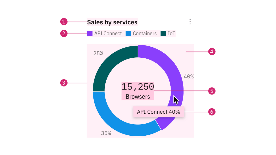
Circular charts are primarily pie and donut charts. Other circular layout charts include radar and solar charts.

Label
A label offers the percentage value of the whole for an individual category.
Big number or KPI
A key performance indicator (KPI) consists of a number with a single word description. Examples include “15,250 browsers”, “$1.3M revenue”, or “Total 450”. A big number inside the donut chart may be used to display a total sum or the individual count of a slice upon interaction. This element can also be used independently on a dashboard (though please note this component is still a WIP and not available outside the donut chart).