Dashboard widgets
Typography
| rem | px | Purpose |
|---|---|---|
| 0.875rem | Plex 14 | Widget title, link, header, body text size |
| 0.75rem | Plex 12 | Empty / no permission / error text size |
Spacing
| Token | rem | px | Role |
|---|---|---|---|
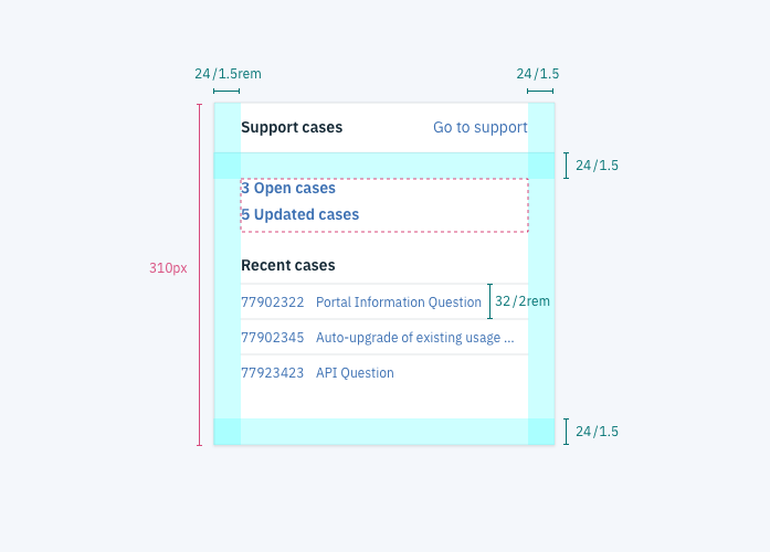
| $spacing-lg | 1.5 | 24 | List line spacing, widget padding |
| $spacing-md | 1 | 16 | All other spacing between elements |
Color
| Carbon variable | Role | Value |
|---|---|---|
$ui-01 | Background color | #ffffff |
$text-01 | Title, header, and text color | #152935 |
$brand-01 | Link color | #3d70b2 |
$text-02 | Empty / no permission / error text color | #5A6872 |
| Bottom border of widget title | #F0F3F6 |
Specs
Padding
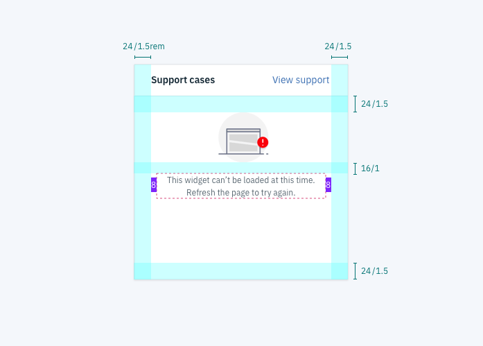
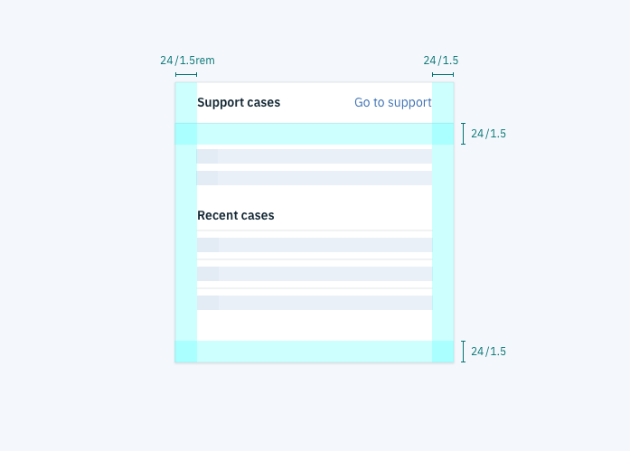
The widget padding should be 1.5rem (24px) for the top, left, right, and bottom of the content area. All widgets should have the same padding, regardless of size.
Lists
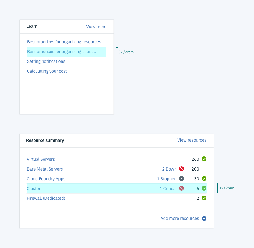
You can style lists with or without rulers separating the rows. In both cases, spacing between the rows should be 32 pixels.
States
Widgets have five distinct states, each with their own styling: normal, empty, permission, error, and loading.
- In the normal state, text is left-aligned except for calls to action
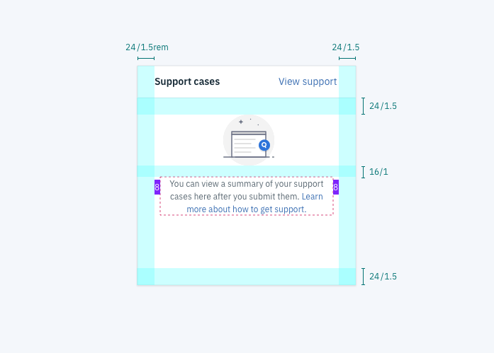
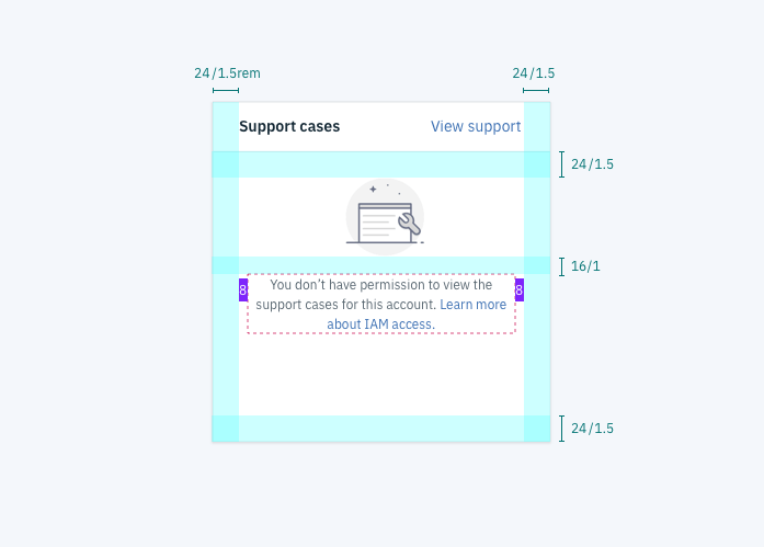
- In every other state, content is center-aligned with an illustration and small, grey text
Normal state
The normal state is the primary state. It occurs when a widget has been populated with data that the user has permission to see.

Empty state
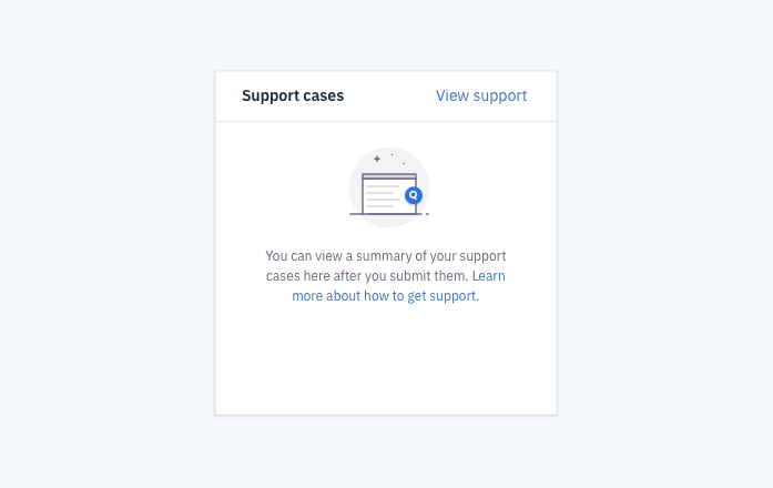
The empty state occurs when the user has no data to populate the widget.
Permission state
This state occurs when a user does not have permission to see the widget data. For example a user may not have permission to manage other users or view usage data.
Error state
The error state occurs when data fails to load.
Loading state
The loading state appears while the widget data loads. Static headers are displayed as text and loading content is replaced by skeletons.
Content
Widget tiles
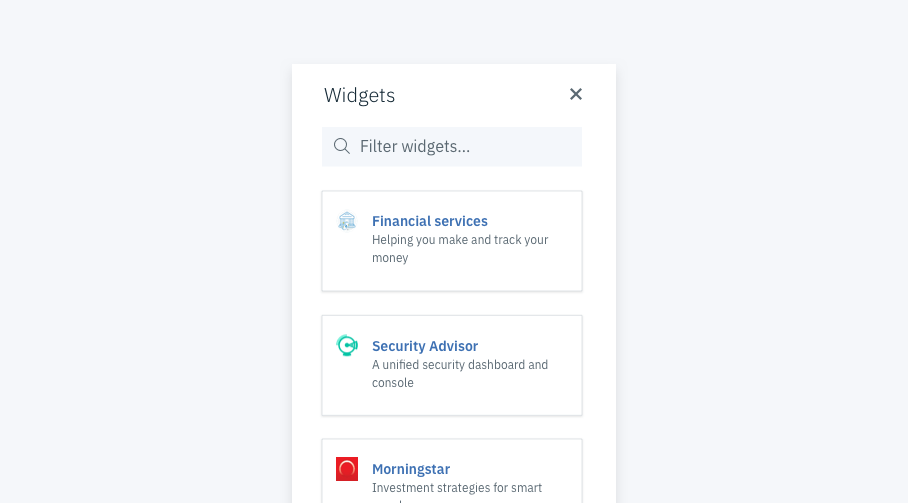
Each widget has a tile that can be seen when users open the “Add widget” side panel during dashboard customization. Each tile features the widget icon, widget title, and short description (max characters: 35).
Illustrations
All dashboard illustrations should be 72x72px and should match the illustration style of these sample dashboard illustrations.
Icons
Use the Carbon icon library for icons within the widget itself.