Login
The login page allows a user to gain access to an application by entering their user ID and password.
Overview
This pattern covers the user ID and password screens seen by users as they log in to IBM products. Federated and non-federated authentication are included in this pattern. Error states, forgot username/password, and additional authentication methods will be covered in future iterations of this pattern.
| Term | Definition |
|---|---|
| Federated users | IBM employees and other enterprise users who use single sign-on (SSO) to quickly log in. |
| Non-federated users | Other users who have a unique username and password to access the product. |
| Single sign-on (SSO) | Directs users to their company’s enterprise sign on and authenticates them using their company credentials. |
Anatomy
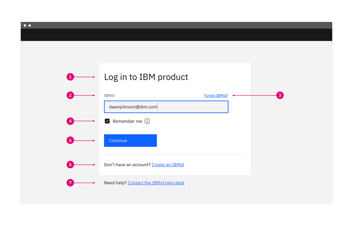
- Title: Log in to IBM [Product name].
- User ID: User IDs are usually in the form of an email address. Depending on the product, this area may also include a filter to specify the ID type.
- Forgot user ID?: Help link specifically for user ID questions and issues.
- Remember me option: Saves the user ID and presents the completed input field the next time the user logs in.
- Continue button: The primary call to action. When clicked, the email address is validated and routes the user to either the federated or non-federated flow.
- Create account option: Link to URX form to create an account.
- Need help?: Help link specifically for user ID questions and issues.
When to use
The login page is presented to users in the following scenarios:
- When a user wants to gain access to an app.
- When a user has logged out voluntarily. They will see a confirmation message after which they will be automatically redirected back to the login page.
- When a user has been logged out due to inactivity. In this scenario, when the user logs back in they should be redirected to the last page they were on, before being logged out.
Behavior
Federated users log in with SSO (single sign-on) and non-federated users are required to provide both their user ID and password. Separate the user ID and password fields into different flows to easily accommodate both federated and non-federated users.
IBM uses multi-factor login for products. The user ID should be requested upfront with a “Continue” button to move forward. This allows the system to distinguish which path the user needs to take in the background instead of making the user read through options and choose. The system validates the username and provides a field for the password only if required.
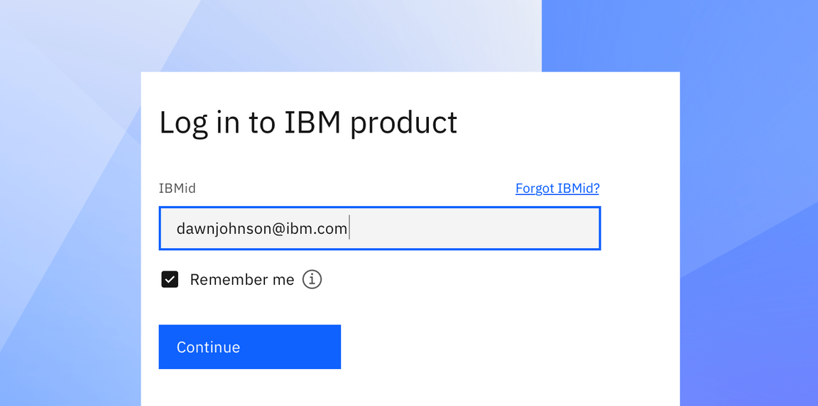
Step 1 of the login flow for both federated and non-federated users
From this point, the user will either continue to their company’s SSO login experience or they’ll see a password field and a “Log in” button. The password page should include a way to return to the prior page in case they make a mistake while filling out their user ID and a “Forgot password” button. When users enter their authentication information progressively, the cognitive load is reduced.
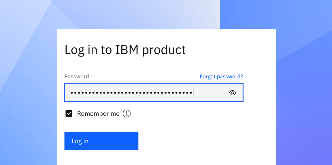
Step 2 of the login flow for non-federated users
Design types
The Login page should focus on the main task of accessing one’s account. The point of this page is to get the user into their account quickly without complicating the workflow. It’s not recommended to include anything that will create too much of a distraction from the form.
Simple illustrations can add personality and help differentiate the form from other products, but they should not pull the user’s focus away from logging in. Consider the simplest approach to logging in to an account on mobile and maintain that simplicity on tablet and desktop.
There are two design options for login pages—the single-column layout and the split-screen layout.
Single-column layout
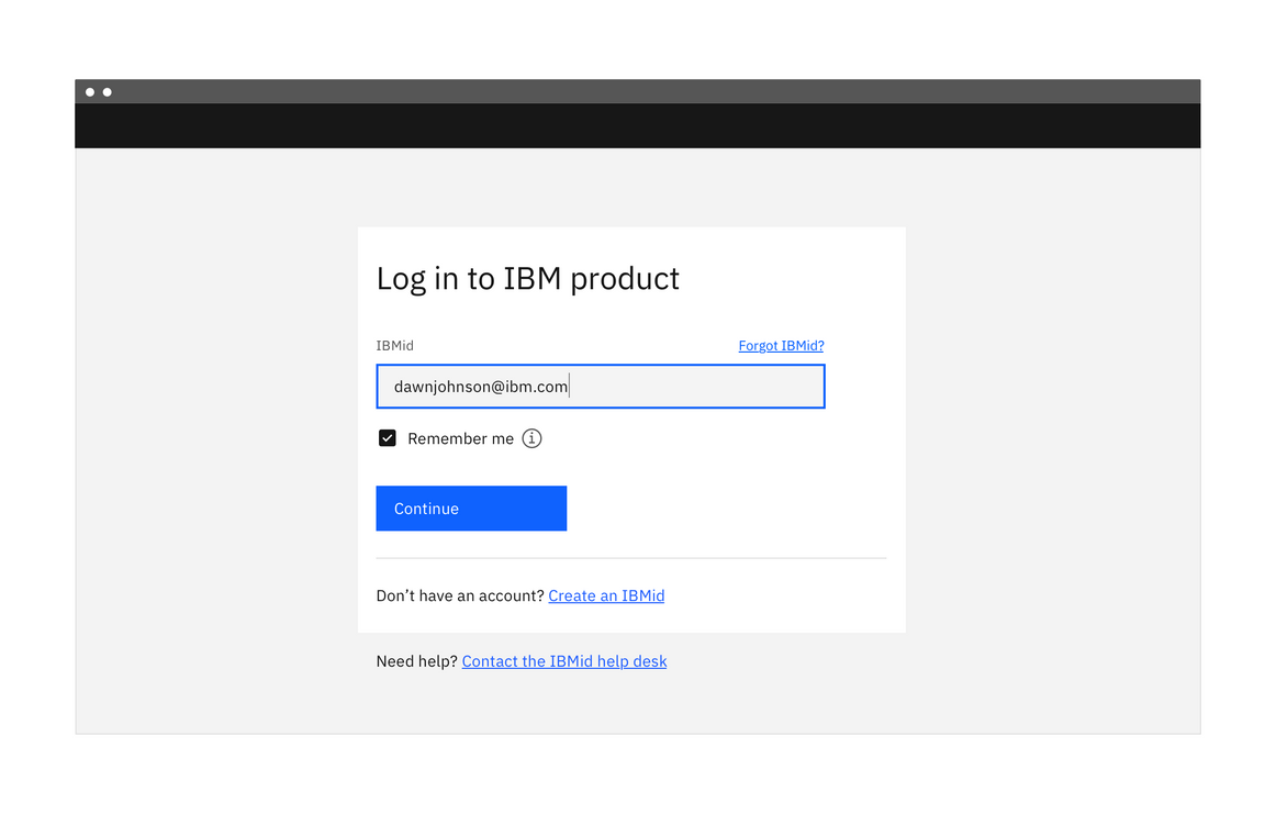
Single column layout login page
Use the single-column login form for a simple entry point for users. Without any distractions on the page, users can focus on their primary goal of signing in to the application or product. Through navigating to the login page, users have already shown intent to log in so additional content about the product isn’t necessary.
Split-screen layout
The split-screen page is an alternate design that can be used to include some marketing content or other visual treatment related to the product. The login portion of this layout uses the same design and behavior as the single-column layout but is confined to one part of the page.
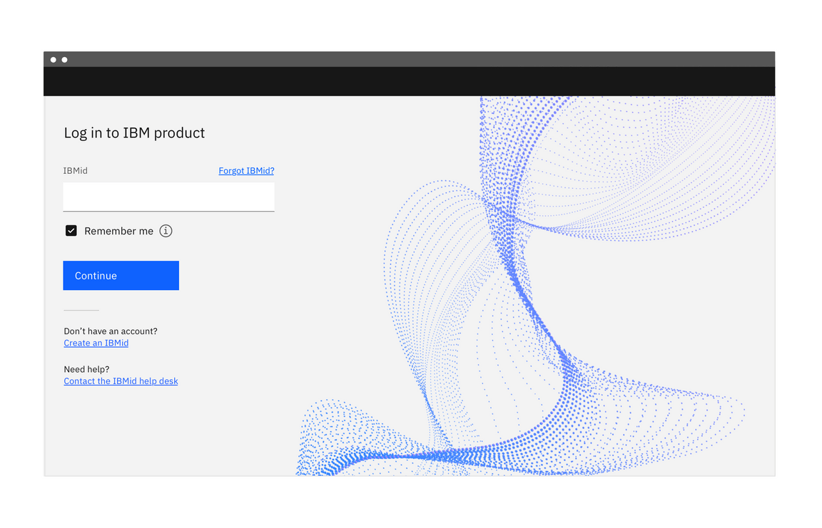
Example of a split-screen login page with product-related visual imagery
Any additional content on this page should be minimal and easy to scan. It shouldn’t distract from the login form. The user’s primary goal is logging in and that should be reflected in the visual design and emphasis on the page.
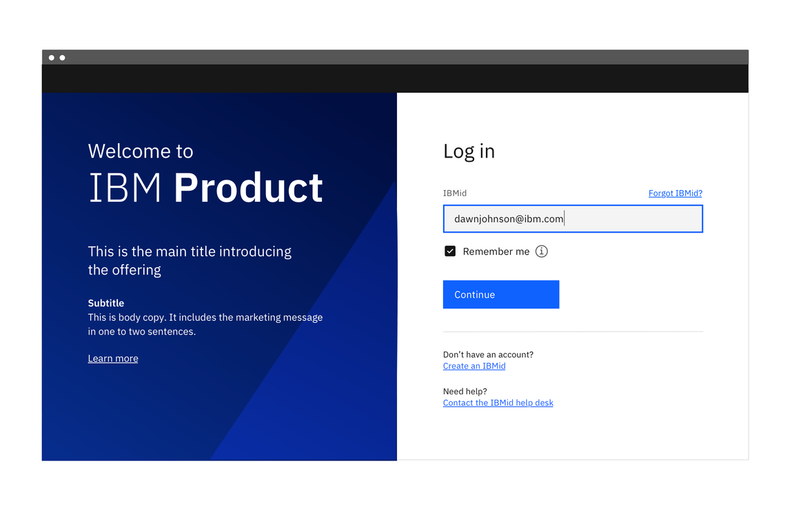
Example of a split-screen login page with marketing content
There may be a need to include some marketing content on this page. When including additional content, be sure to keep the marketing and login content separated. Testing has shown that users don’t look outside of the login region to find related actions such as create account or SSO buttons, and often miss those actions if they are embedded in the marketing content.
Best practices
Do:
- Use the phrase Log in, not Sign in. This is to make it visually distinct from Sign up. They’re often side by side and the different words allow for quick distinction between the two options.
- Use Log in to [Product name], with Log in as two words.
- Let users log in quickly. Keep the login page uncluttered to reduce cognitive and visual loads.
- Use a clear call to action, that is correctly sized. This reduces the motor load or physical effort it takes to perform the action.
- If you’re using a split-screen design, include a clear division between the content on each side—marketing copy or visual imagery on one side, login details on the other. Do not mix the two.
- Include forgot password and forgot ID buttons near each of their respective text fields, rather than including them both on each page.
- Offer to remember the login information to speed up logging in next time.
- Put simple sign up links with the login content, not the marketing content.
Don’t:
- Don’t make users sign in until it’s necessary.
- Don’t present options to “Log in using SSO” or “Log in using User ID.” Have the system do the work for the user by authenticating information progressively.
- Don’t remove fields abruptly. For example, don’t show a password field upfront and then hide it when the system recognizes that the email is associated with a federated account.
Accessibility
Ensure that users can tab through the login form and navigate the page using only a keyboard. Use landmark regions to designate the login region and allow screen readers to skip directly to the input fields. This is especially important if you are using the split-screen layout or have additional content on the page.
Related
References
- Raluca Budiu, Login Walls Stop Users in Their Tracks (Nielsen Norman Group, 2014)
- Lee Munroe, Login vs Sign in, (2010)
- W3C, Using AIRA landmarks to identify regions of a page
- Susan M. Weinschenk, Ph.D., 100 Things Every Designer Needs to Know about People (New Riders, 2011)
Feedback
Help us improve this pattern by providing feedback, asking questions, and leaving any other comments on GitHub.