Modal
Modals communicate information via a secondary window and allow the user to maintain the context of a particular task.
General guidance
Modals interrupt user workflow by design. They are most effective when a task must be completed before a user can continue. While effective when used correctly, modals should be used sparingly to limit disruption to a user experience.
Dismissal
Modals may be dismissed in 3 ways:
- Using the “✕” in the upper right-hand corner of the modal
- Pressing the
ESCkey - Clicking or touching outside of the modal
Format
The modal is composed of three distinct zones: A header, the body, and a footer. Components (eg. data table, form, progress indicator) can occupy the full width of the modal.
Header
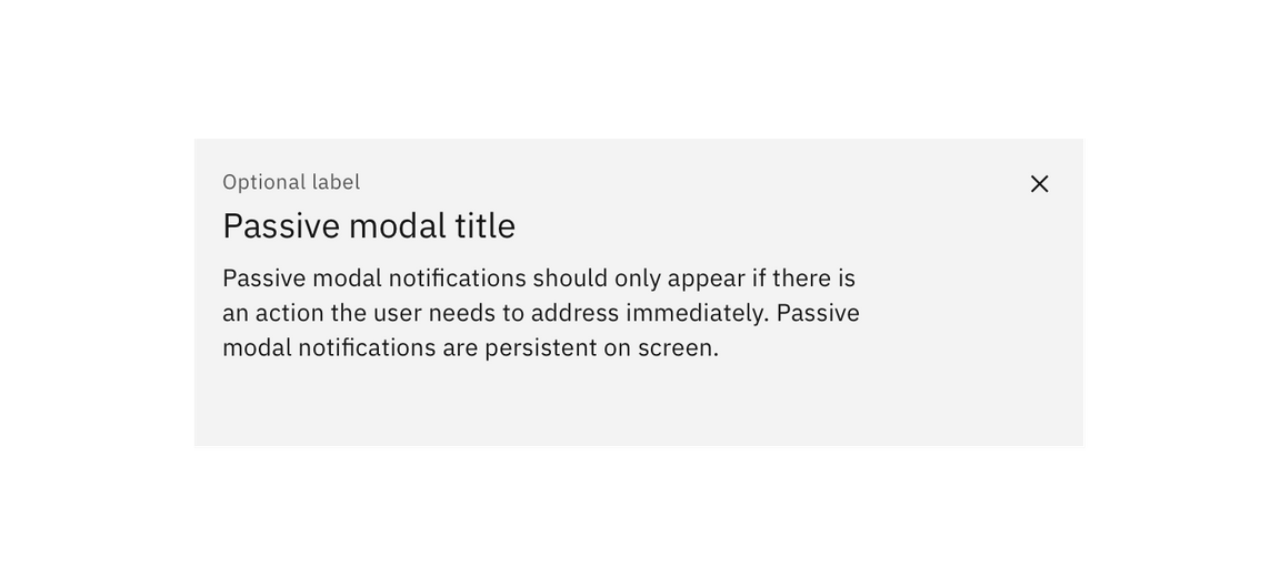
The header of your modal should mirror the action that launched the modal. Headers must include a close button “✕” in the upper right-hand corner of the modal. You can also include an optional label above your header text. This is an opportunity to offer additional context.
Body
A modal should have minimal body content. Components that may be used in modals include: form fields, text area, select, and radio buttons. Text, including the paragraph component, should only be 75% of the modal’s width.
Footer
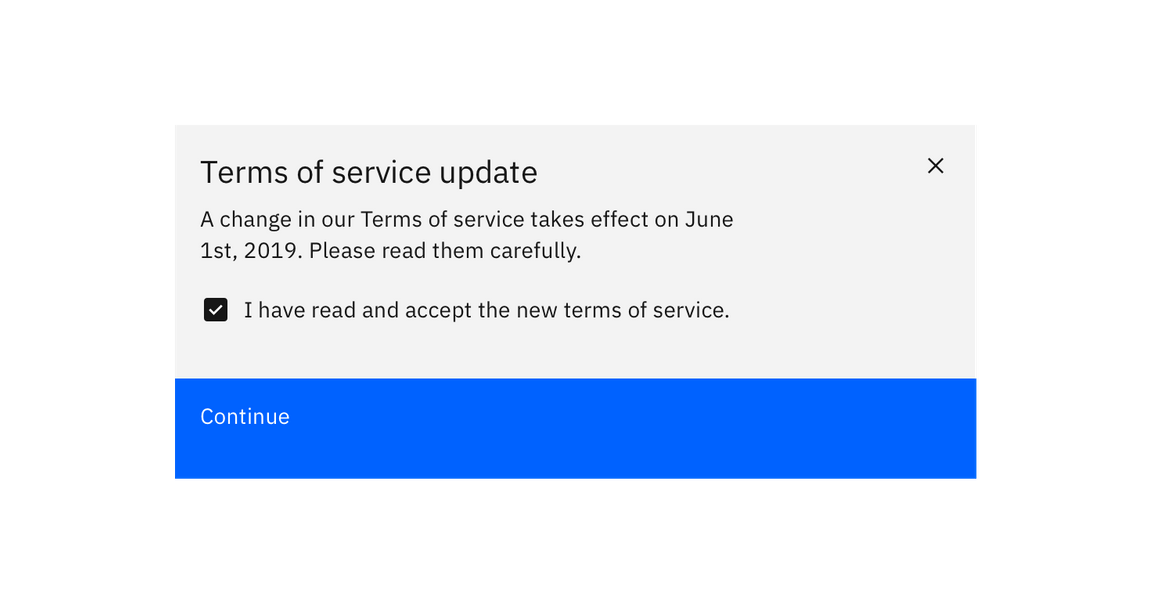
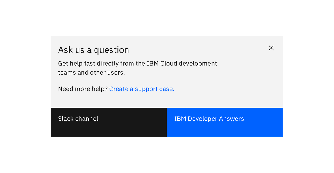
The footer area of a modal typically contains either one or two buttons. Do not include three buttons in the footer of your modal. If you need to include a “help” or other non-primary action, include it as a link in the modal’s body.
Variations
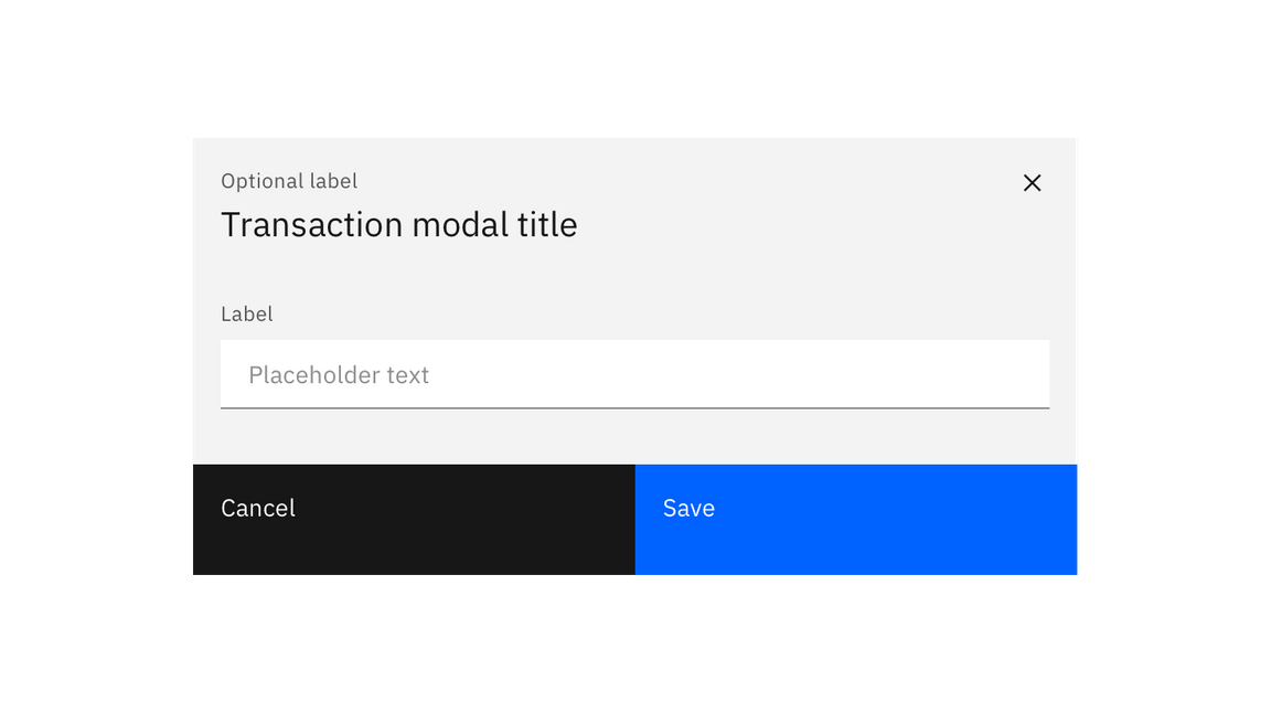
Transactional modal
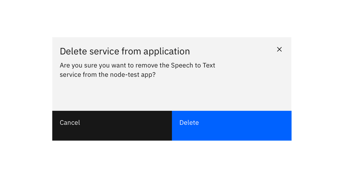
Transactional modals are used to validate user decisions or to gain secondary confirmation from the user. Typically, the modal requests either a ‘yes’ or ‘no’ response.
Input modal
Modals used in this case include input areas that the user may interact with. These may include but are not limited to forms, dropdowns, selectors, and links.
Passive modal
The passive modal is a style of notification. Passive modals are highly disruptive to a user experience, and should only be used if a user must address something immediately.
Passive modal notifications are persistent on-screen. Users must either engage with or dismiss the notification.
